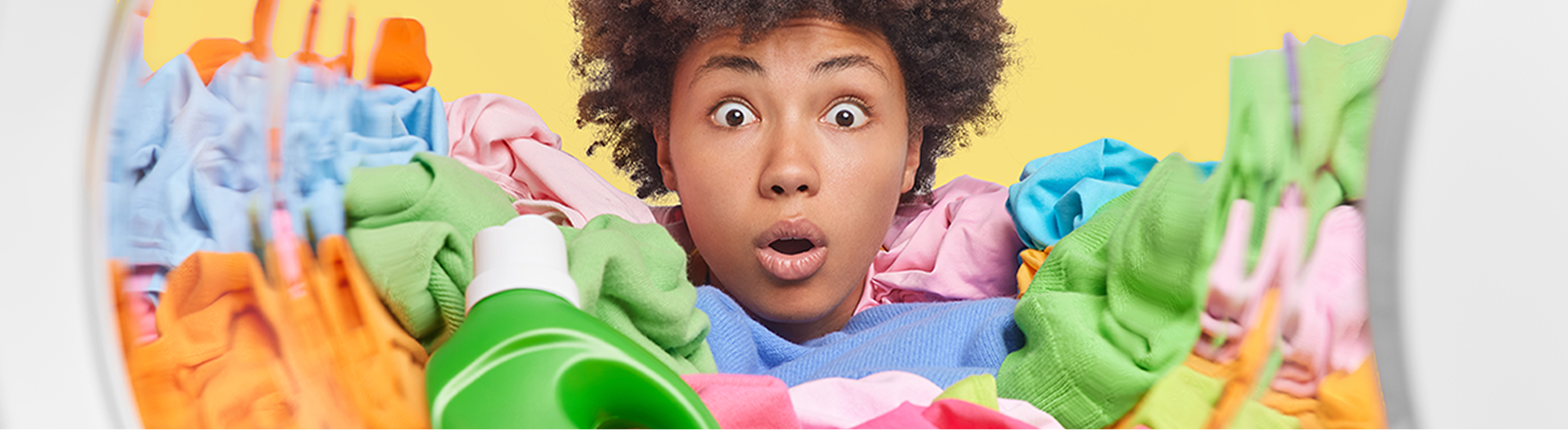
I wanted Fluent to feel clean and optimistic rather than leaning into the typical “earthy” look that often signals eco products. This led to a bright, saturated palette and minimal type that communicates clarity and ease.
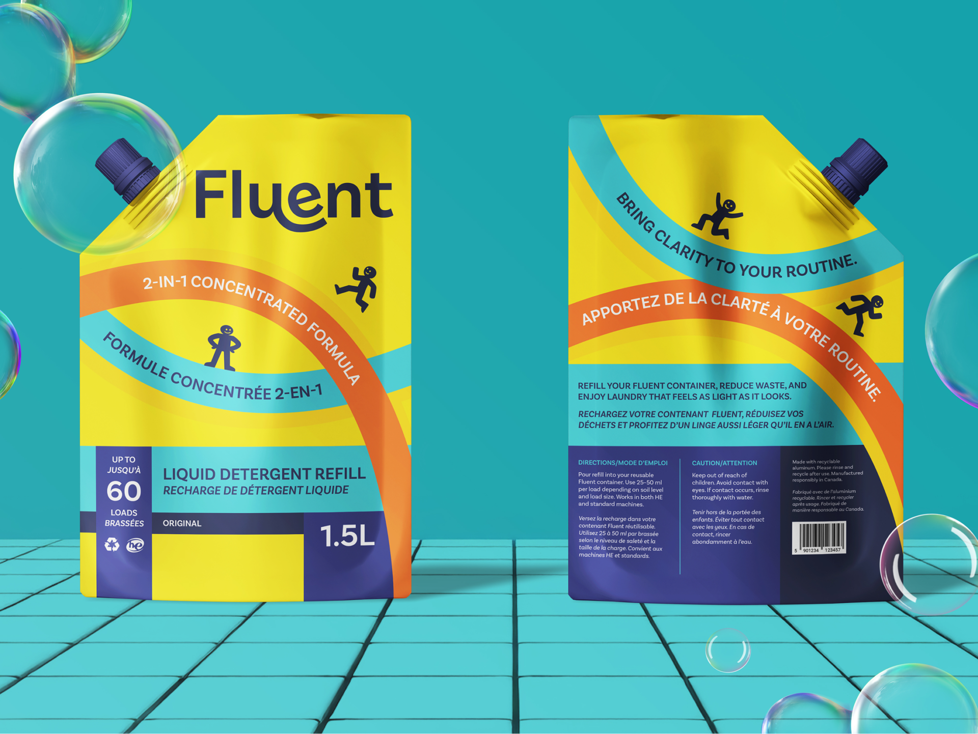
I sketched several branding directions before choosing a logo built around rounded, friendly shapes. The hanging U and angled E subtly mimic the motion of a washing machine drum, which reinforces the product category without being literal. The overall identity is simple, rhythmic, and easy for customers to recognize at a glance.
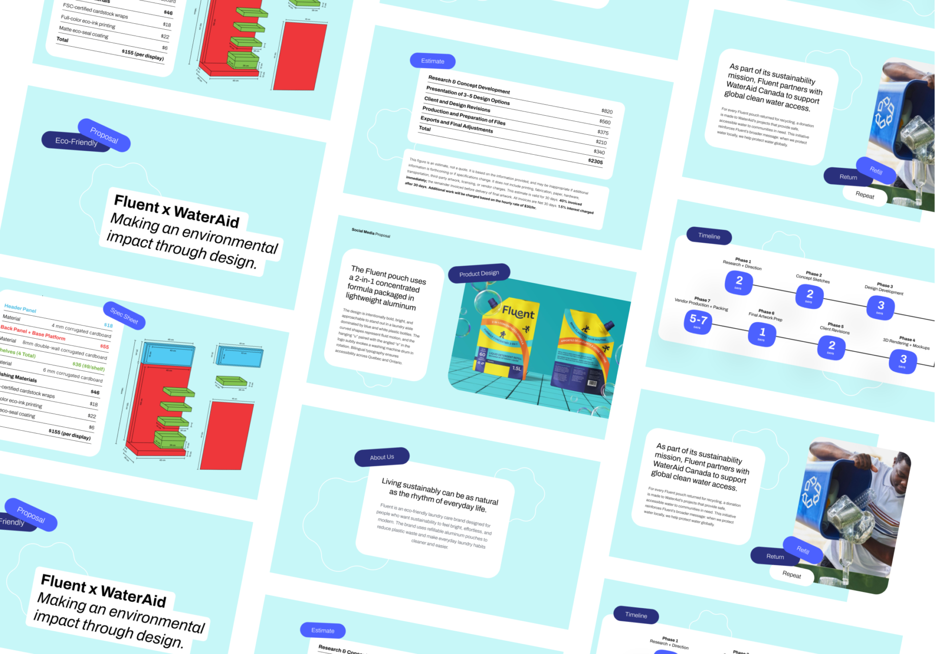
I reviewed different types of sustainable packaging used in the home care industry, comparing plastic bottles, carton-based containers, and flexible pouches. Aluminum pouches offered the strongest balance of durability, recyclability, and lower environmental impact. Aluminum can be recycled indefinitely without losing quality, uses significantly less material than traditional detergent bottles, and stacks flat during transport, lowering emissions.
This refill model allows customers to pour the contents into their existing containers at home, reducing the need for single-use plastics and encouraging a circular approach to laundry care. The material choice communicates Fluent’s values directly while keeping production realistic and affordable.
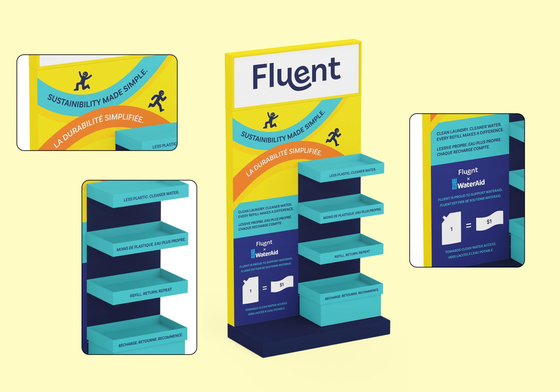
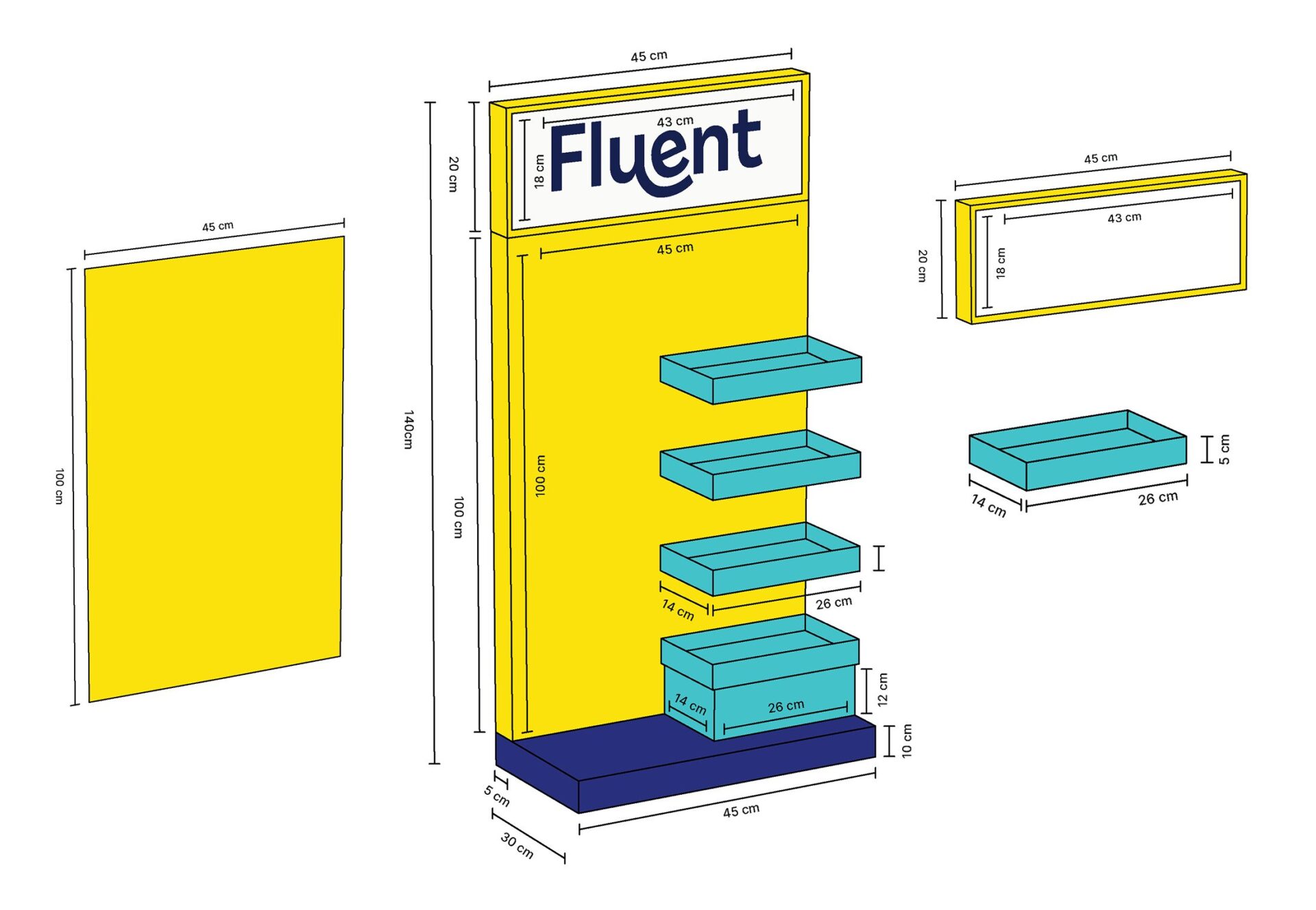
The POP display was designed to promote Fluent during a clean water charity initiative. I created a tall cardboard structure with four shelves, bold colour blocking, and simple calls to action. Each shelf highlights a core message about reducing plastic waste and supporting clean water access.
The display is made from recycled double-wall corrugated cardboard with reinforced internal supports to stay stable in a retail setting. The design keeps text minimal and uses icons to make the donation system clear. The goal was to create something playful and accessible while maintaining a strong focus on sustainability.