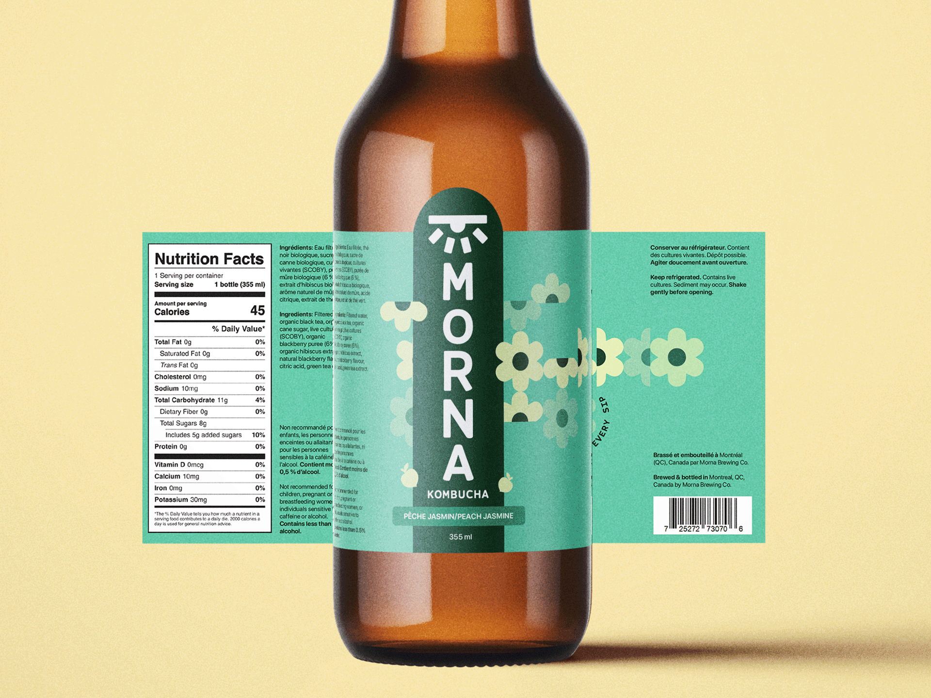
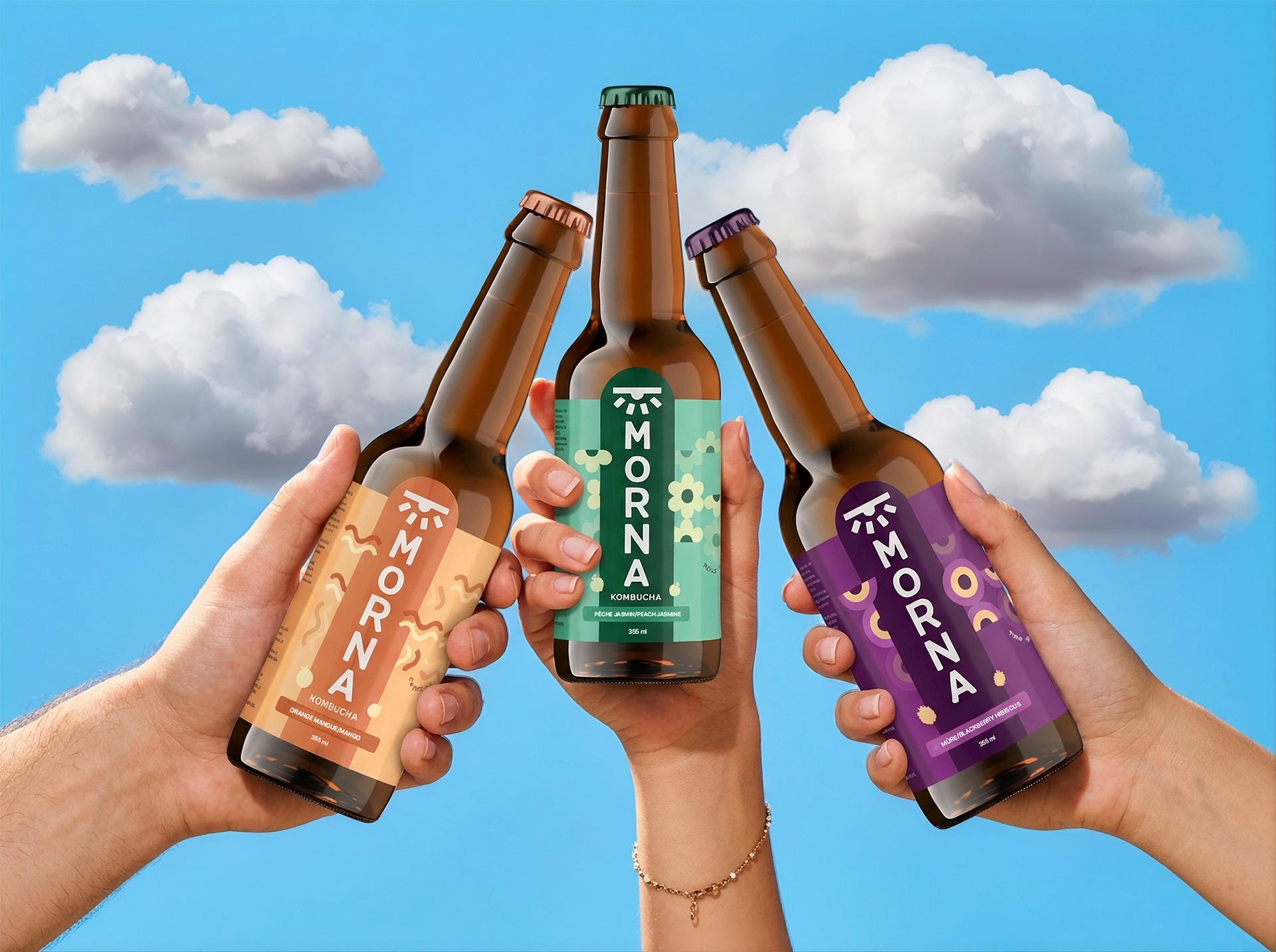
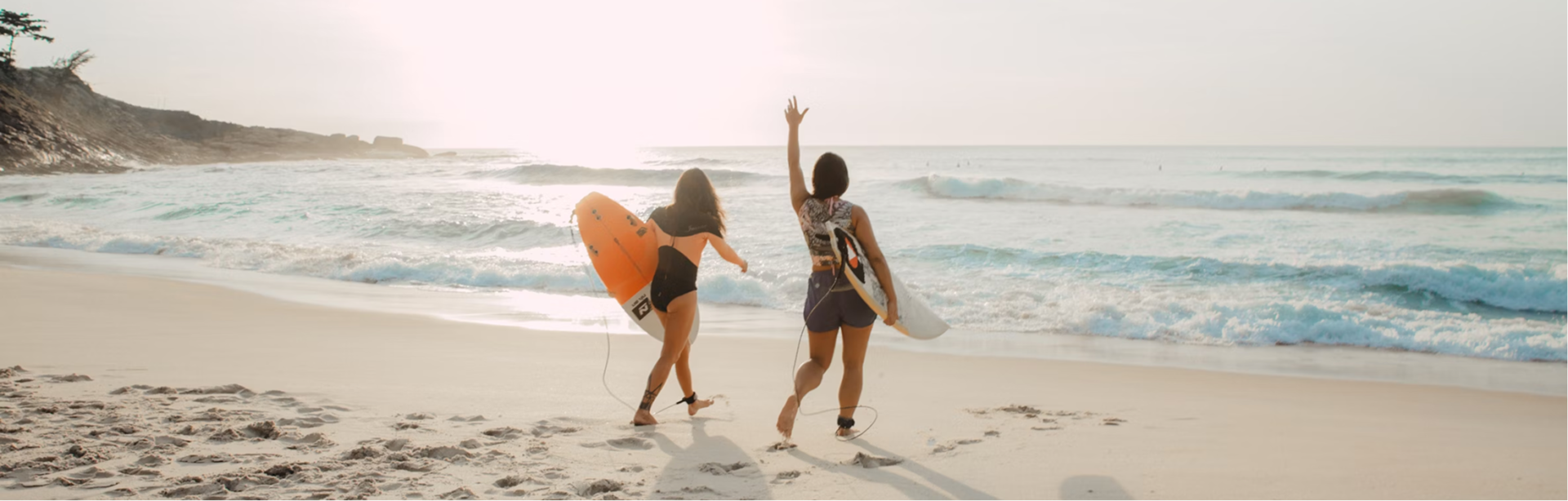
MORNA is a Montreal-based kombucha brand inspired by the phrase “good morna,” a playful twist on good morning. The brand brings together wellness and retro nostalgia with a lighthearted, modern feel.
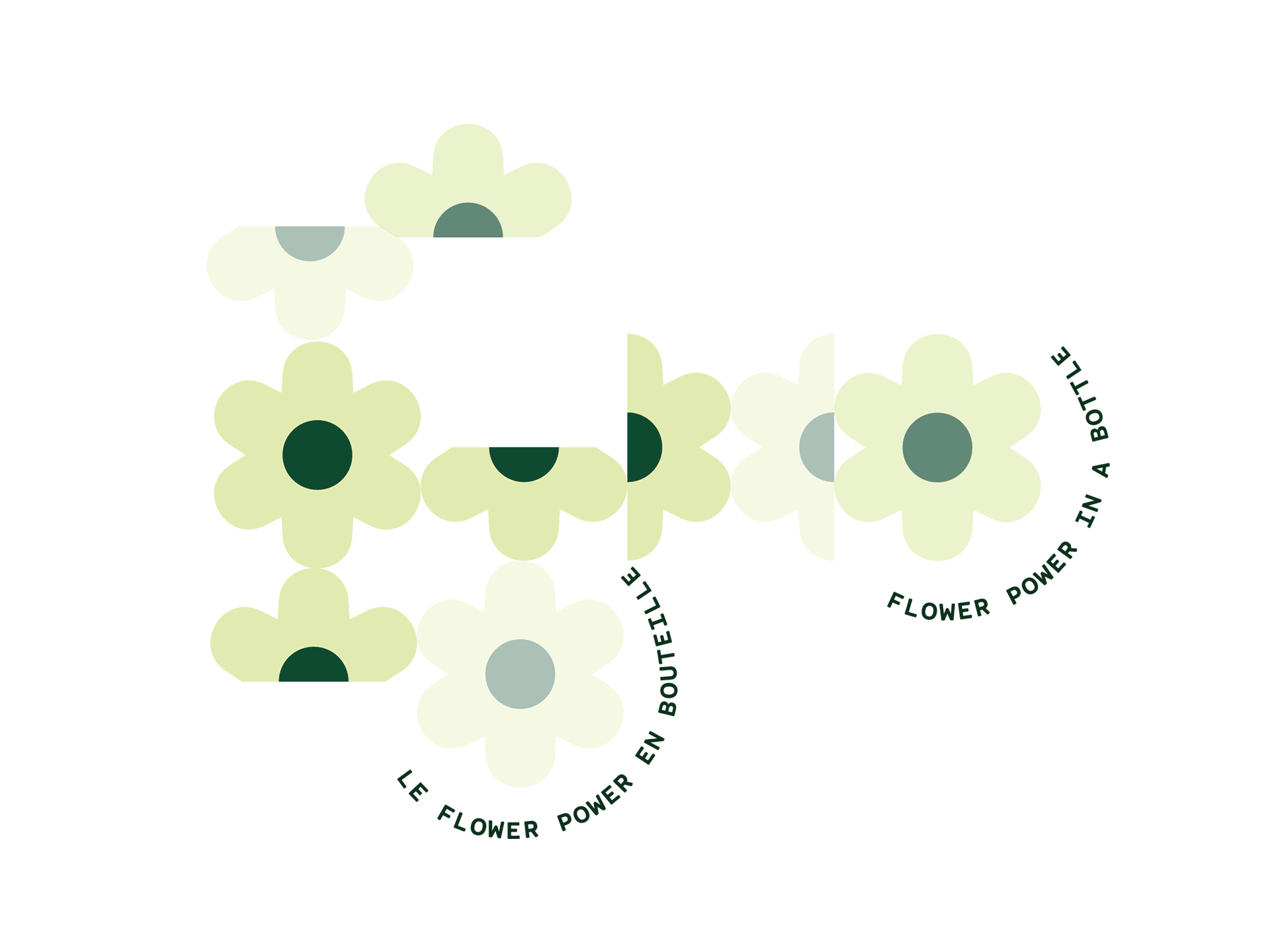
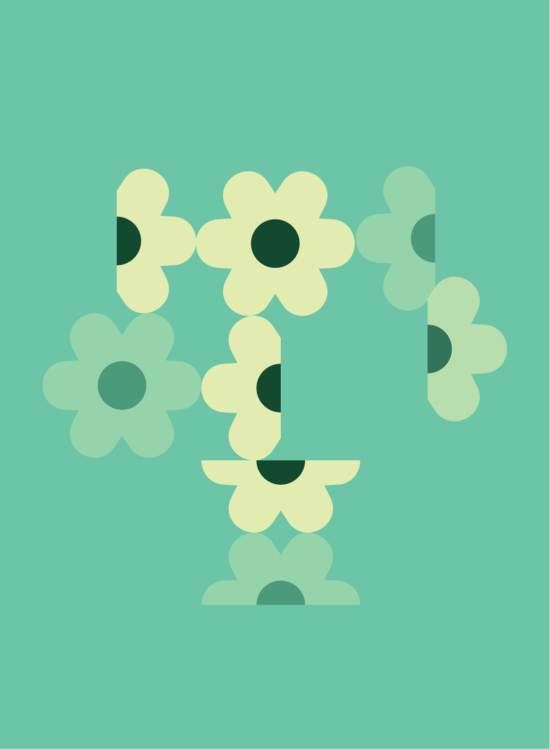
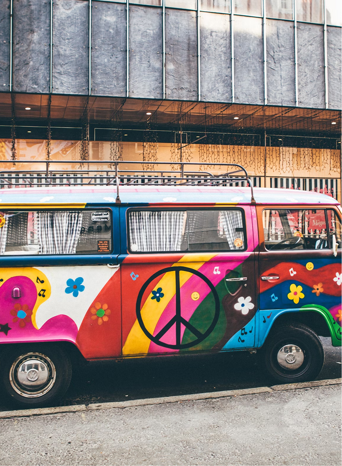
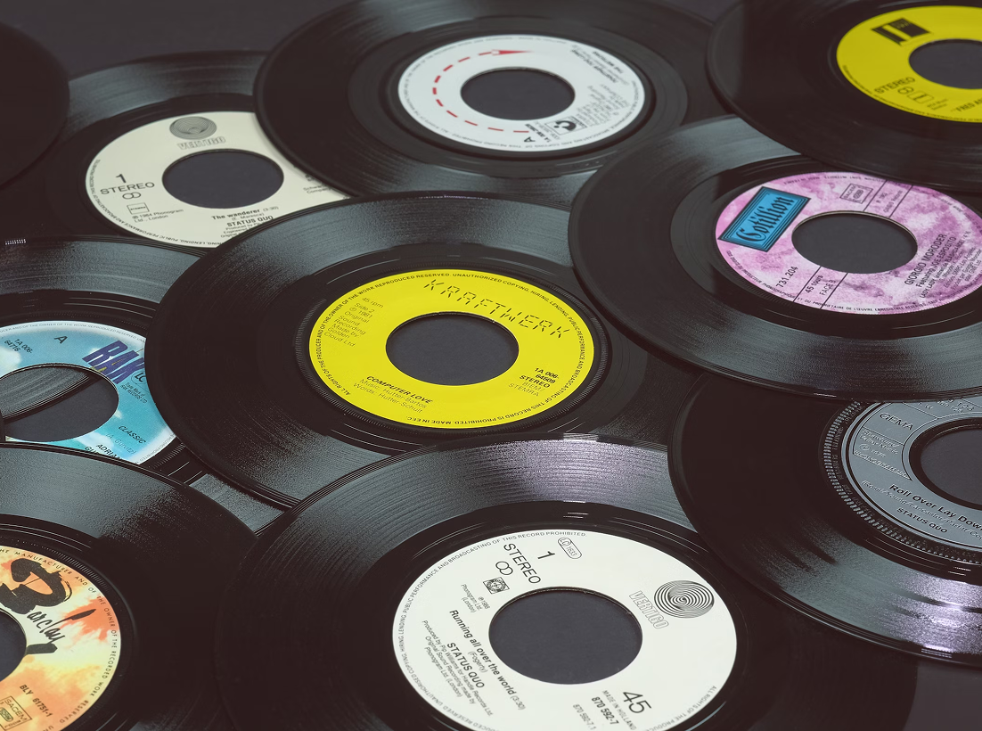
For this project, I developed 3 bilingual label designs for a new flavour line, each one influenced by a different pop-culture theme from the 70s. The goal was to capture MORNA’s cheerful personality and vintage-inspired style through bright colour palettes, clean layouts, and abstract illustrations that feel both nostalgic and fresh.
Combining the shape of a rising sun and an awakening eye, it symbolizes clarity, renewal, and a bright start to the day, tying back to the “Good Morna” concept, a playful slogan based on the phrase “Good Morning”. The eye suggests mindfulness and awareness, while the sun represents warmth, optimism, and energy.
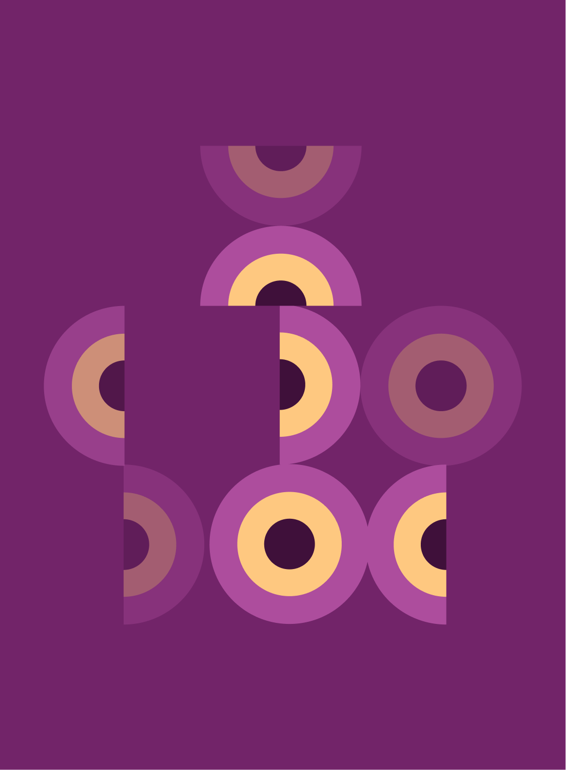
The color palette mixes soft purples, turquoise, light greens, oranges, and yellows. These shades were inspired by the playful and unexpected color combinations popular in the 70s. I wanted to capture that same sense of fun and nostalgia but in a way that feels brighter and more contemporary. The mix creates a cheerful, easygoing energy that reflects MORNA’s retro spirit without looking old-fashioned.